The brief
Maureen Chiquet is a former CEO of Chanel, an author, and an artist. The site serves as her professional home: a portfolio of her artwork, the landing page for her book, an archive of media coverage, and a single front door for everything her audience comes looking for.
I built the WordPress theme from the ground up — no parent theme, designed from a wireframe, fourteen hand-built Gutenberg blocks. The brief was simple in shape: a clean, editorial site that loads instantly and doesn’t get in the way of the work it presents.
What I built
A performance-first architecture. The site achieves 100/100 Lighthouse scores on both desktop and mobile — without WP Rocket, without Autoptimize, without any of the optimization plugins WordPress sites typically lean on. The performance comes from the architecture itself, not bolted on after the fact.
All CSS inlined in <head>. Every stylesheet — the main 24 KB
compiled CSS plus the @font-face declarations — is concatenated and
emitted as a single <style> tag at priority 5 on wp_head. Zero
render-blocking external stylesheets. Combined with HTML caching at the
server level, this trades cross-page CSS caching (which a cached HTML
response makes irrelevant anyway) for guaranteed sub-100ms First
Contentful Paint.
Per-block CSS via block.json. Each of the fourteen custom
Gutenberg blocks registers its own style.css through its block.json
manifest. WordPress only enqueues a block’s stylesheet when that block
actually appears on the page. The result is naturally sparse CSS —
a homepage that uses six block types loads exactly six block
stylesheets, not the kitchen sink.
JavaScript that’s mostly absent. Total JavaScript on a typical page
is about 660 bytes — a single deferred color-scheme toggle in
vanilla JS. No jQuery, no React hydration, no @wordpress/element
runtime. WPForms and its honeypot are dequeued site-wide and
re-enqueued only on the contact page. Twelve of the fourteen blocks
are server-rendered PHP with zero client JavaScript. The two
interactive blocks — a hero slider and an artwork viewer — use the
WordPress Interactivity API for lightweight AJAX navigation rather
than full hydration.
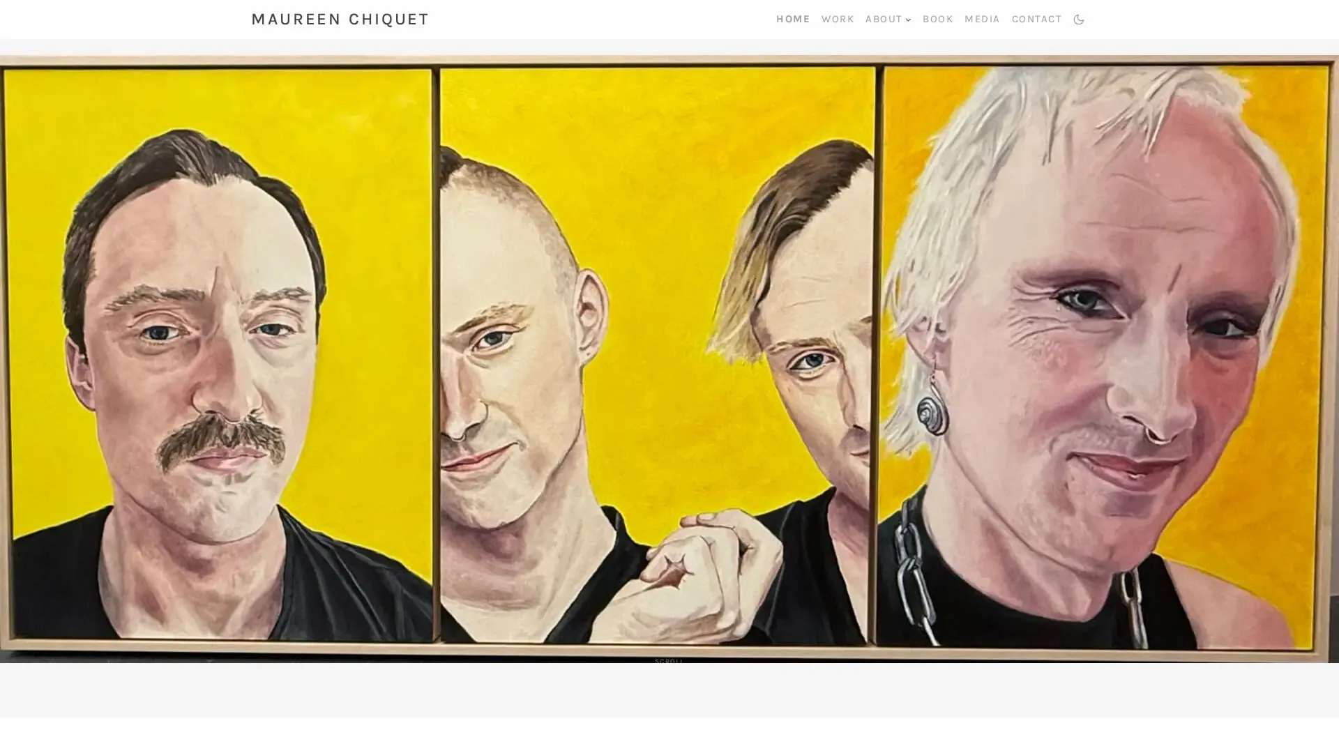
LCP image preloading via ACF. A wp_head hook reads the homepage’s
hero-slider ACF field, finds the first image’s attachment ID, and emits
<link rel="preload" imagesrcset="…" imagesizes="100vw" fetchpriority="high"> before body parsing begins. The browser starts
fetching the hero image at full resolution during HTML parse, not after
discovering the <img> tag.
Image and font discipline. Karla is a single variable font file
covering weights 200–800 — self-hosted, preloaded, font-display: swap
— in place of the four or five static weight files most themes ship
with. All artwork imagery converts to WebP at upload (the full
artwork archive went from 84 MB of JPEGs to 22 MB of WebP); .htaccess
rules redirect JPEG requests to WebP for browsers that send
Accept: image/webp. Image sizes are context-specific
(grid thumbnail, hero crop, viewer detail, og-image) so the right
resolution loads for the right placement, and every image renders
inside a container with an inline aspect-ratio style so the layout
reserves space before the image data arrives. Cumulative Layout Shift
stays at zero across the page lifecycle.
What’s notable about it
The 100/100 Lighthouse scores are repeatable because the theme enforces performance patterns at the architecture level. Inline CSS, per-block stylesheets, server-rendered blocks, deferred minimal JS, preloaded LCP image, variable fonts, WebP — these are all theme-level decisions made once and applied everywhere. There’s no plugin to misconfigure later, no optimization layer to forget to enable, no “remember to purge the cache” step. The performance is the architecture; the architecture is the performance.